Elesi Blog
Lighting Guides & Interior Design Tips
-
Smart Technology: What is Zigbee?
Zigbee is a wireless communication protocol designed for low-power, low-data-rate applications, primarily in the realm of home automation, smart devices, and industrial control systems. Here's... -
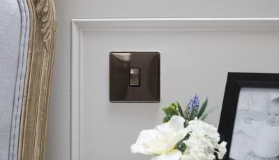
What is an Isolation Switch?
An isolation switch is a crucial electrical safety device designed to disconnect a part of an electrical circuit from the main power supply, ensuring that... -
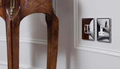
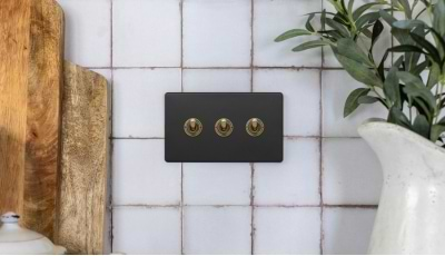
The Ultimate Guide to Socket and Switch Finishes
One of our most popular ranges here at Elesi is our ranges of sockets and switches, and with so many different finishes to choose from... -
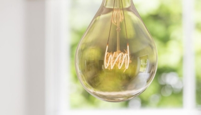
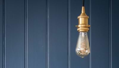
Bulbs: The Complete Guide
Choosing the right bulb for your needs can be overwhelming given the variety of options available. With so many choices from different fittings, colour temperatures... -
What Colours Go with Silver?
Whether you’re incorporating silver hardware, decorating your walls with silver highlights, or adding silver furnishings to your space, choosing the right colour palette can help... -
How to Identify if Brass Is Real
Solid brass lighting is not just visually stunning, but it’s also incredibly versatile, and can work with a wide variety of different interior design styles... -
Smart Bulb vs Smart Switch
Smart systems are becoming the standard across many homes in the UK as technology improves and becomes increasingly more convenient and customisable. With smart lighting... -
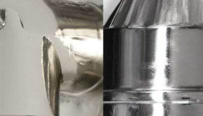
Nickel Vs Chrome: What’s the difference?
Choosing a finish for your home can often be a challenge when faced with multiple different types of finish. It’s likely that you know you... -
What is Scandi Design?
Scandi, or Scandinavian interior design is a minimalist and functional design style originating in Nordic countries such as Norway, Denmark, and Sweden in the early...