
Gold is a gorgeous colour to use in your interiors and is available in a multitude of 'golden' shades, though this shouldn't be mistaken for metallic gold, a yellow shade with flecks of gold glitter.
All gold starts as pure yellow gold, and the differing shades include mixing small amounts of white gold and rose gold where the metals are alloyed to give them their specific shade, whether more yellow, orange, or pink.
What Colours Go With Gold?
If you're looking to add golden accents to your home, we explore the different colours that go well with gold.
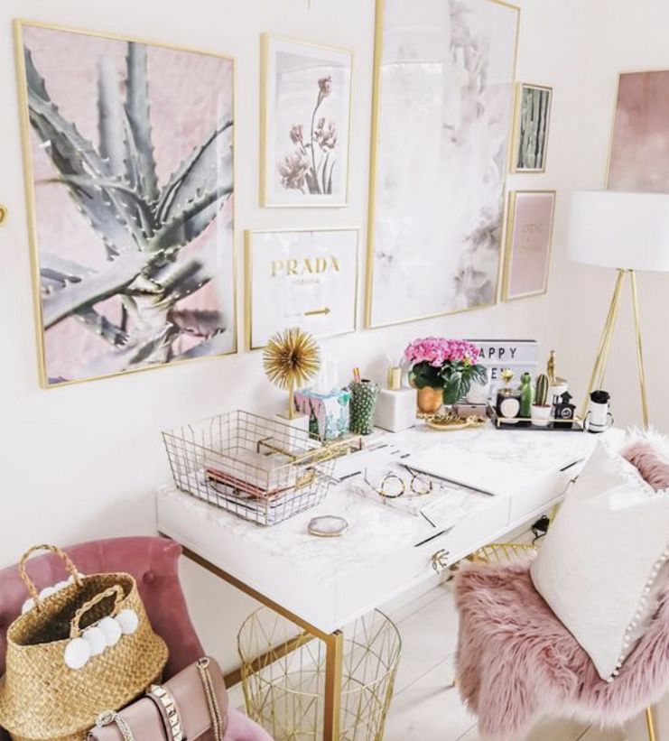
Gold & Pink
The colour combination gold, or rose gold and pink gold shot to stardom because of the 'millennial pink' trend. This notorious colour combination works so well together in interiors and is often seen paired with marble. There's probably nothing more millennial than this trio!
Pink is usually seen as the dominant colour and is complemented with gold accents through furnishings, accessories and interior hardware.
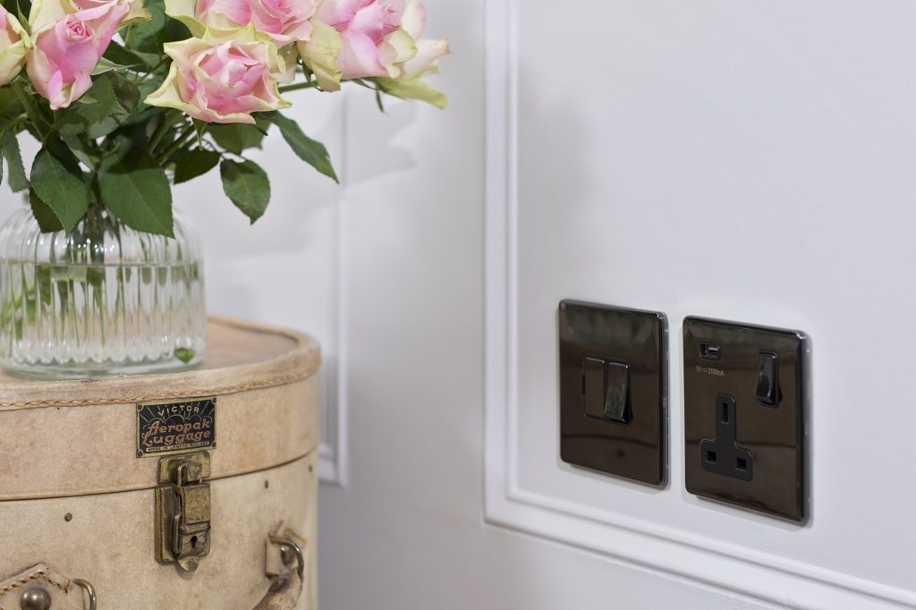
Gold with Black & White
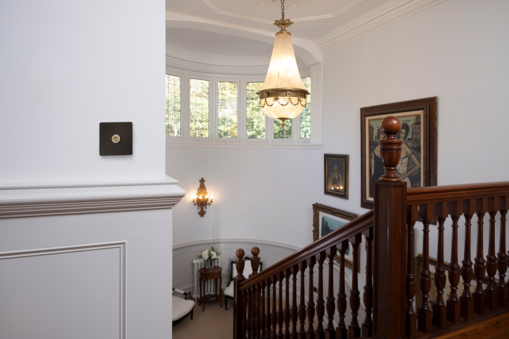
You can't go wrong with this classic and timeless monochrome combination. It's a fail safe match when it comes to gold. The best way to use gold is to pull the room together with it by using subtle accents. Such as through sockets and switches, cabinet hardware and decor accesories.
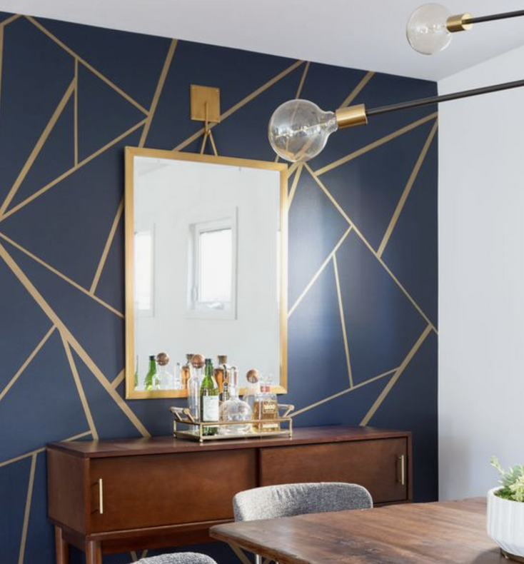
Gold & Blue
Gold works extremely well with multiple shades of blue, from the lighter end of the spectrum right through to something as dark as cobalt blue. The two colours contrast perfectly together for maximum impact.
Painting your walls with a shade of blue and contrasting with gold artwork or interior hardware will really allow the gold pieces to pop. The muted tones of navy blue work especially well to contrast this bright and shiny metal.
Gold & Grey
We know that gold is a match made in heaven for grey marble, so unsurprisingly it complements grey in an interior too.
Lighter shades of grey offer a neutral and subtle backdrop to work from. This makes it the perfect foundation for bringing in a bold colour such as gold. The difference in the two colours creates an eye-catching and striking look.
Dressing a grey room with gold accents will help to nail this combination perfectly.
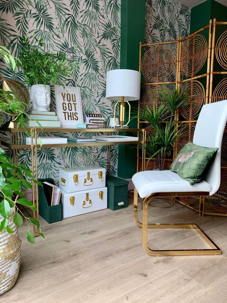
Gold & Green
Pair forest greens with gold to make a bold statement. Whether you do this through way of paint, wallpaper or just by incorporating houseplants, gold and green are a force to be reckoned with in your interior.
But no matter what hue of green you go for, incorporating this complementary pairing will result in a trendy, natural looking space.
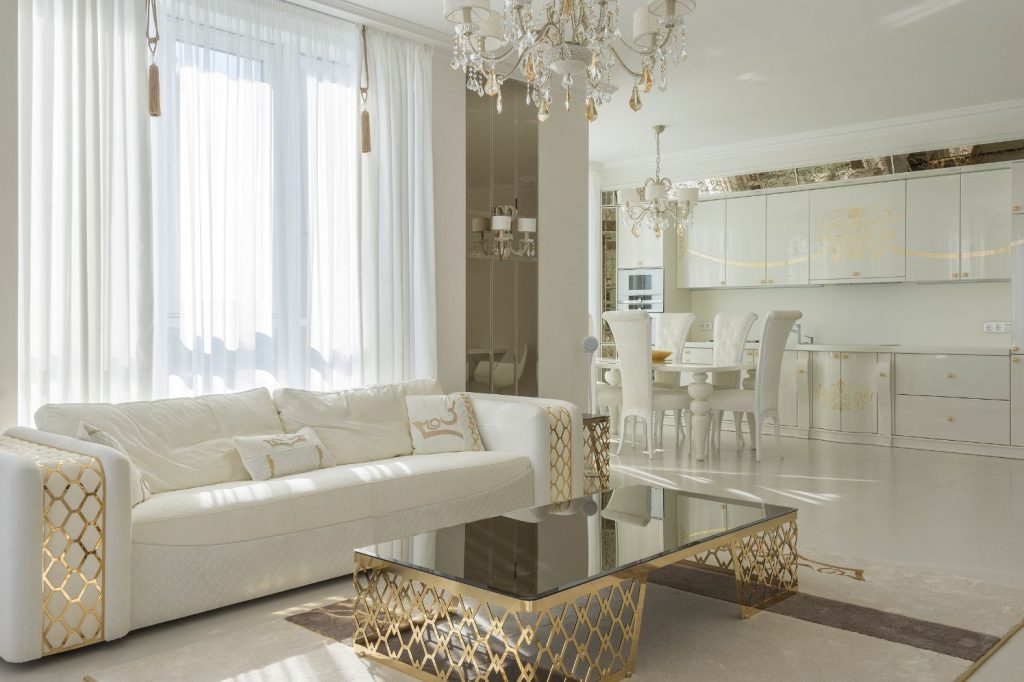
Gold & White
Of course, gold and white are a timeless and elegant combination when paired together. A classic combination that is seen at weddings, during Christmas and through interiors.
White provides the best blank foundations to build on. You would very rarely see gold and white on their own without introducing any other pops of colour. But because of this classic pairing, most colours will integrate well with them too. From bright colours such as pink and purple, through to black and charcoal grey. This combination works especially well in living rooms for an airy and welcoming atmosphere.
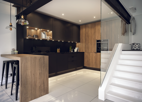
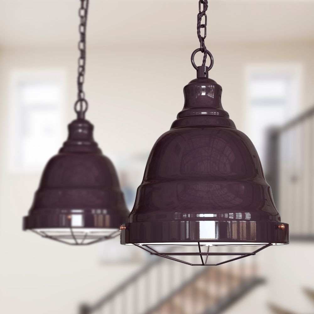
There are so many different colours that go with gold that it's an easy colour, and metal to work into your interior to make a statement. Why not consider gold downlights to really blend with your interior?
[related_products is_auto_added="1"]If you’re looking to add golden accents to your home, we explore the different colours that go well with gold.
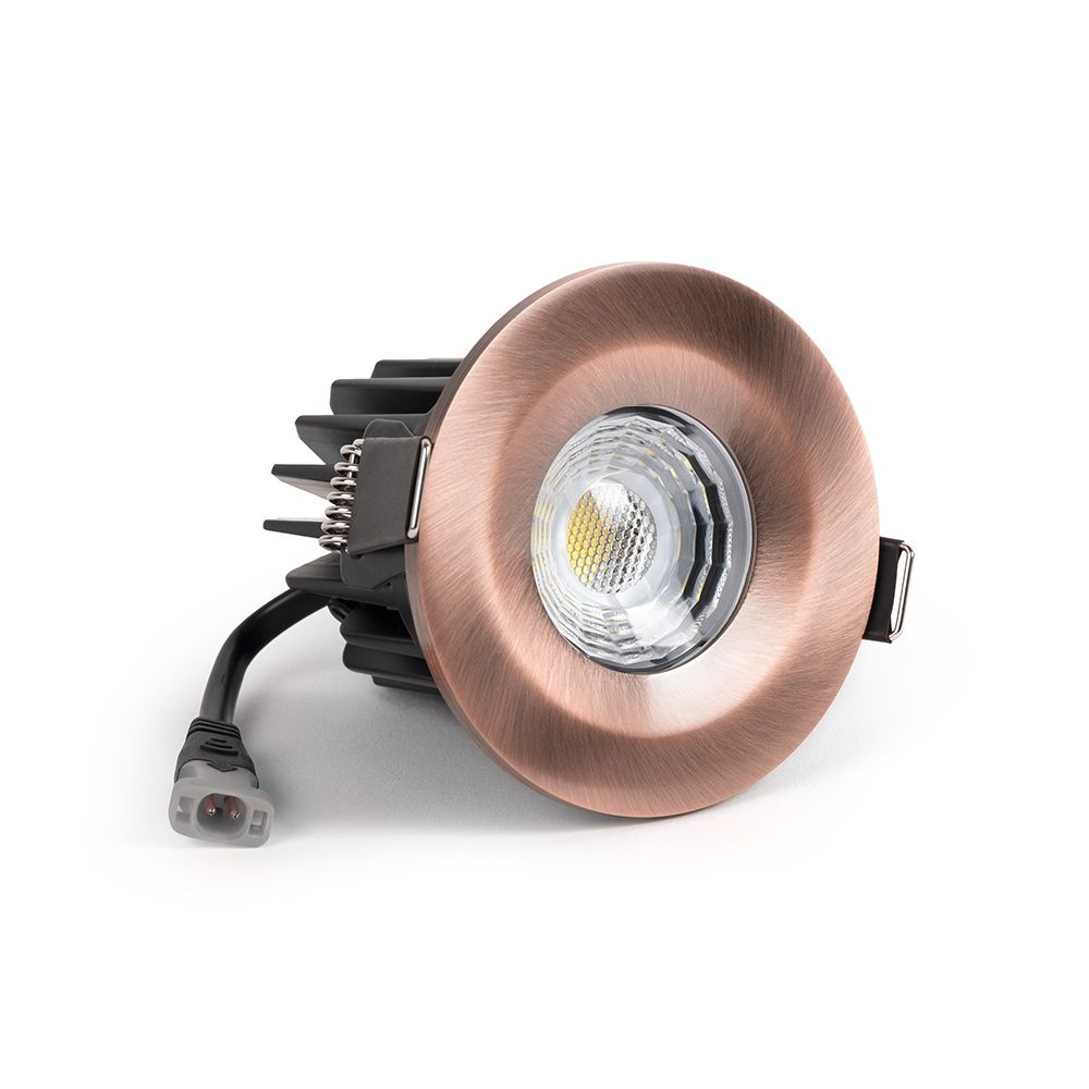
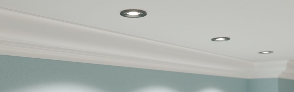
Downlights are a great option for a lighting setup. They provide well balanced lighting throughout a space, whilst looking streamlined and tidy.
They are ideal for most rooms in the house. Available in a number of different styles to suit your requirements.
To help you with your next downlighting purchase, we discuss the things that make a good downlight, and the specifics to look for.
What Makes A Good Downlight?
Aesthetics aside, there are a number of factors to look for in downlights which will arm you with the technicalities that make the difference between poor quality, and good downlights.
Fire Ratings - Compliance
Perhaps one of the most important things to look out for is the fire rating of a downlight. According to the Electrical Safety Council, fire rated downlights should be used in all ceilings, no matter what type of building in which they are installed.
Fire ratings will usually be rated at 30, 60 or 90 minutes, or all three. This rating depends on the size and structure of the building. A top floor flat would likely require at least a 90. Whilst the bottom floor may need 30 or 60 minutes.
IP Ratings - Compliance
IP ratings determine the levels of sealing effectiveness of electrical enclosures against intrusion from foreign bodies. This is an important rating to look out for when you're looking to light certain rooms in your home.
If you're looking to furnish a room such as a bedroom or living room, downlights with an IP rating of IP44 + will be suitable.
When it comes to areas that are subject to damp and moisture such as a bathroom, you're going to need something a bit higher. The bathroom is split into various zones which depict their level of moisture. You'll normally see this as Zone 0, 1 or 2. Zone 0, which represents the space inside the shower would require an IP rating of IP67 which is total immersion proof.
CRI - Colour Rendering Index - The Quality of Light
There's more to choosing the colour of lights than you think. Colour rendering index or CRI is the measurement of how faithfully an artificial light represents the full colour spectrum of natural sunlight. The higher the CRI, the better clarity of colours. High CRI lighting enhances the true colour of foods to aid preparation, can help with colour-based tasks such as painting, improved clarity and definition of images and text and lift your general mood and home life.
When looking for downlights, look for the highest CRI downlights available. Anything from 97-100 CRI represents the closest to natural daylight which will greatly improve the clarity of the activities you carry out in your home, and your mood.
At Elesi Lighting we are delighted to offer The Soho Lighting Company range of high >95-97 CRI downlights. Their high CRI output makes them the perfect choice for kitchens and bathrooms. As well as rooms where activity, reading or relaxation takes place.
LED Lighting
Where possible, look for LED downlights. When compared to halogen bulbs, LED lights can provide a whole host of benefits including reduced electricity bills and a longer lifespan.
Many halogen bulbs have now been banned in the EU due to energy efficient reasons. But it's still an important consideration to take into account.
Take a look at our full range of downlights to find the perfect lights for your home.
[related_products is_auto_added="1"]To help you with your next downlighting purchase, we discuss the things that make a good downlight, and the specifics to look for.

When it comes to completing the finer details of your home such as the interior hardware, there are plenty of finishes to choose from.
If you're not sure whether anthracite is the right finish for your home, we explore exactly what it is and how you can incorporate it into your home.
What Is Anthracite?
Dating back to the late 16th century, anthracite was discovered and described by Pliny as something that resembles coal. The name has a Greek origin of anthrakitēs, from anthrax, anthrak- ‘coal’.
In its purest form, anthracite, otherwise known as 'coal' is a hard, compact type of coal. It has a sub metallic lustre and is one of the highest ranking forms of coal. Coal has the highest carbon content of any mineral, it has a carbon content of between 92.1% and 98%. This means that it contains very few impurities.

What Is Anthracite Finish?
The anthracite rock is black, with a metallic gloss, this is why the dominant colour is black, but it simultaneously falls into the grey spectrum of colours. However, Anthracite can come in a wide range of colours from black to steel grey, and even blush pink. As you can imagine, this makes for a wonderful finish once polished for decorative purposes in your home.
Anthracite remains a very sought after finish in home interiors, renown for that lovely, smoky dark charcoal colour. It remains a very contemporary finish in both industrial and modern interiors. Anthracite is one of the most expensive minerals available, because of this, it does give that added edge of luxury when used in an interior.
When it comes to interior hardware, anthracite finish looks stunning on sockets and switches, door handles, radiators and other interior hardware. This is a finish that is a wonderful for giving your home that luxurious edge.
[related_products is_auto_added="1"]If you’re not sure whether anthracite is the right finish for your home, we explore exactly what it is and how you can incorporate it into your home.
Lighting to Lift Your Mood
The UK lighting supply market is dominated by low CRI LED downlight products. In 2020 it was estimated that over 90% of domestic downlights available on the UK market provided a CRI of less than 82. The growth of LED downlights has been exponential in recent years and low CRI LED chips are now produced in massive volumes at low cost. In recent years break throughs have been achieved in producing high quality LED chips with CRI > 95.
This break-through now enables homes and workplaces to benefit from ultra-efficient LED lighting at higher CRI levels, bringing the benefits of greater clarity, improved colour differentiation and more ‘natural’ artificial lighting. Such lighting enhances the true colour of foods to aid preparation, can help with colour-based tasks such as painting, improved clarity and definition of images and text and lift your general mood and home life.
In 2021 after years of research and development Soho Lighting launched its range of high >95-97 CRI downlights. Our market leading high CRI LED downlights offer a built-in colour temperature changing function so you can set your downlights to warm, daylight or cool. They are fire rated to 30, 60 and 90 minutes and are certified to IP65 making them the perfect choice for Kitchens and Bathrooms as well as rooms where activity, reading or relaxation takes place. The smart lighting choice that will provide at home relief from winter and work-from-home blues.
What is CRI and how does higher CRI in Indoor Lighting Benefit Humans
We can all recall our childhood excitement at the sight of a rainbow and for those who paid attention in physics lessons at school, you can probably recall that it is produced when sunlight encounters rain. The sunlight reflects off the inside of a water droplet, separating it into its component wavelength or colours. Dig a little deeper and you may even recall that the 'colour' of an object is derived from the wavelengths of light that it reflects, as opposed to the ones it absorbs.

Bananas appear yellow as they reflect yellow light from the spectrum.
So what happens to the colour of a banana when viewed with an artificial light source where the yellow colour has been removed from its wavelength? You get a murky green/orange-grey coloured banana and a far less appetising treat!
This same distortion of colour is a problem with many forms of artificial indoor lighting, where the colour spectrum omitted does not represent the full spectrum of coloured light as would be seen in natural sunlight. Such a deficiency not only affects how we perceive colour, it can also render small details, objects and print difficult to decipher as well as negatively affecting our state of mind.
CRI – Colour Rendering Index
CRI (Colour Rendering Index) is a quantitative measure defined by the International Commission on Illumination (CIE) of how faithfully an artificial light represents the full colour spectrum of natural sunlight. 100 CRI is equivalent to natural sunlight and will show the true colours of an object. We experience the effect of low CRI at night when walking under a high-pressure sodium streetlight. Such streetlights have low CRI of around 25 and if you have ever attempted to look at a map under one, you will know just how difficult it is to clearly distinguish text or colour on a page. This is because the light omitted from the streetlight is in a very narrow colour band, meaning little colour or tone contrast is reflected back from the objects it illuminates.
CRI and CIE Ra Value
The value often quoted as "CRI" on lighting products can also be referred to as CIE Ra value, "CRI" being a general term and CIE Ra being the international standard colour rendering index. So a CRI of 80 is the same as CIE Ra 80.
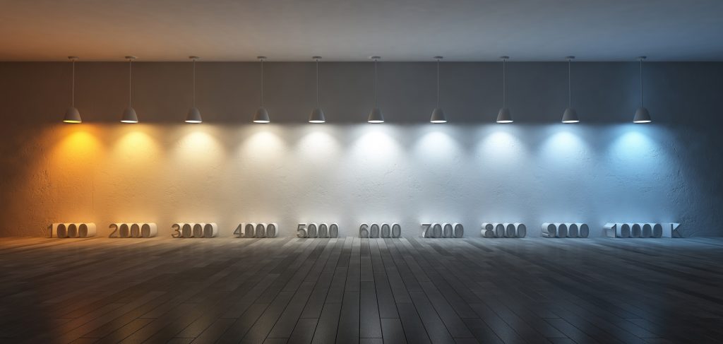
CRI/CIE Ra and colour temperature are different measures of light output. Colour temperature is a way to describe the warmth or coolness of artificial light and is measured in degrees of Kelvin (K) on a scale from 1,000 to 10,000. Typically, Kelvin temperatures for commercial and residential lighting applications fall somewhere on a scale from 2000K sunset white to 6500K daylight white. In this context, the ‘daylight white’ is a reference to its whiteness/coolness, not the amount of colours represented in the spectrum. Think of the different colours of the sun and the sky from sunrise to sunset and you get the idea, the natural sunlight may change in tone, but the CRI remains at 100 throughout the day.
The Potential Health Benefits of Higher CRI
You are probably familiar with the growing concerns around sunlight deficiency, its impact on human emotions and associated conditions such as Seasonal Affective Disorder (SAD). It turns out “sunny disposition” is more than just an expression: Researchers at BYU found an increase of depression in people during seasons with little sun exposure. On the contrary, days with ample sunshine linked to better mental health.
Numerous studies have cited the health benefits of sunlight on humans, which increases the production of beneficial chemicals such as serotonin and nitric acid, leading to improved mood, better quality sleep, improved cognitive function and lower blood pressure.
Early studies into the impact of higher CRI from artificial light on humans is also indicating health benefits linked to improved concentration and mood enhancement. There is evidence to suggest that work productivity is also increased. Whether the body is being tricked into thinking it is in natural light is unclear, however higher CRI also improves colour definition, variation and visibility which might also be a factor.
It is not difficult to imagine how miserable it would be to work indoors under a low CRI streetlight with a gloomy permanent orange glow and little colour differentiation. However, how high does CRI have to be to provide acceptable working conditions for humans? 80 CRI/Ra 80 is considered to be the minimum acceptable threshold for indoor lighting for the home and work environment. But even at 80 CRI/Ra 80 many colours will not be a true representation of themselves as they would be under natural light and this may in turn place a strain on our visual systems leading to increased stress or strain.
[related_products is_auto_added="1"]In this blog post, We look at the new range of High CRI LED Downlights from Soho Lighting

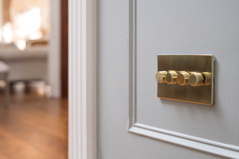
With a bright gold appearance, brass has long been a popular choice in interior design in both period styled and statement properties.
Brass is an alloy of copper and zinc, however, with varying levels of these components, brass can also appear to be reddish-gold or silvery-white. Brass adds instant timelessness and elegant authenticity to any project.
What Colours Go Well With Brass?
As such a popular metal, we explore the different colours that go well with with brass.
Brass & Turquoise
Brass works superbly with bold blocks of colours. Don't shy away from this bold combination, just ensure that you keep other elements in your home neutral.
A subtle way to combine these colours could be through turquoise and brass home decor, sockets and switches.

Brass & Bronze
These two metals can hold their own, but combine them together and the result is a classic and elegant finish.
Our Fusion range highlights just how perfectly these metals works together. The matt bronze faceplate is perfectly complimented with the warm tones of a brushed brass switch.
Brass & Monochrome
Contrasting black and white with brass is a fail safe combination. Brass accents can give black and white a much needed injection of warmth.
Subtle use of brass in a monochromatic space really does help to break of the monotony of the colours.
Brass & Forest Green
Inspired by nature, forest green and brass is a classic yet bold colour combination. This particularly works well by way of using forest green on the walls and using brass in subtle accents throughout. This could be done through interior hardware detailing such as door knobs and sockets and switches.

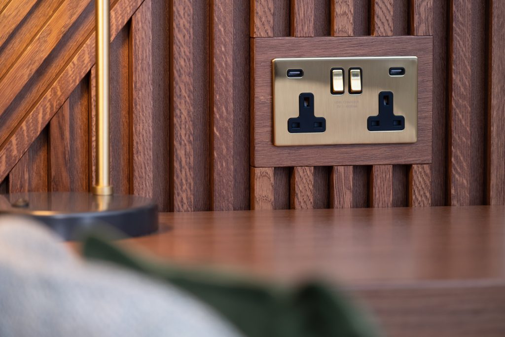
Brass & Brown
Brass works incredibly well with natural, rustic spaces. A nice brown or natural wood finish works incredibly well with brass as it helps to lift the colour. Both of the components allow the other to take centre stage, this makes it a wonderful pairing.
As pictured below with a Brushed Brass socket, the natural brown colour and the brushed brass draw from each, this helps to bring out the underlying tones of the colours.
Brass & Mustard Yellow
Whilst you could say that these two are very close in their underlying tones, brass and mustard both do work really well together.
These two colours sit close together on the colour wheel, and in the right environment can be considered adjacent. The key here is to balance the colours out and to not have too much of one thing. Adding a third colour into the mix such a brown or natural wood will help to balance it out.
If you're looking to incorporate brass into your home decor, take a look at our range of brushed brass sockets and switches. They are perfect for adding that subtle accent of brass to your home that's timeless and elegant.
[related_products is_auto_added="1"]With a bright gold appearance, brass has long been a popular choice in interior design in both period styled and statement properties.
I'm sure we've all been on the receiving end of 'you've forgotten to turn off the lights' at some point in our life. But it's often not until we live in our own homes that we begin to realise the importance of switching them off.
We know that leaving lighting on when it shouldn't be on is both wasteful, and contributes to our already expensive electricity bills. But it's more important than that we think to switch them off. We explore further to find out exactly what the impact of leaving our lighting on is.
How Common Is It For People To Leave The Lights On?
It's a bigger problem than you think. A study conducted by Utility Design on leaving the lights on revealed;
- 6.5 million people admit to leaving the lights on when they aren't in the room
- Daily average cost per user of leaving the lights on - £2.30
- Monthly average cost per user - £64.51
- Yearly average cost per user - £838.66
- Total money wasted in the UK everyday - £14, 950,000.
When you collectively group the findings together, the results are phenomenal.
Electricity Bill
It's a well known fact that the more electricity we use = the more expensive our bills will be. However, the misconception is that 'if I accidentally leave that light on a little bit longer than it should be that it won't make a difference'. Maybe not on a one off occasion. But if you continue to do this daily, your pockets will start to feel it.
As the study identified, doing this on a daily basis could cost you on average an extra £838.66. £2.30 could equate to that daily cup of coffee on your lunch break. But totalling that figure annually is what gets us to really think about this problem.
Money is the one thing that does make us think about problems, and it's so easy to make this change!
Other ways to keep those electricity bills low could be by switching to LED lights which can help to combat some of the issues that are caused by continuing to leave the lights on. LED lights are up to 80% more effective than traditional lights. Thus less energy use reduces the demand from power plants and decreases greenhouse gas emissions.
Light Pollution
It's important to note that leaving your lights on isn't just an internal problem, it affects us externally too.
According to UK Power, a recent study discovered that artificial light near waterways is disrupting food chains as insects are being drawn towards the lights and away from the water surface and their natural predators. Indeed, with carbon dioxide emissions aside, leaving your lights on is affecting our eco-system too.
Turtle numbers are also dwindling. As the new hatchlings are usually guided out to sea by the moonlight, however, the artificial lighting across beaches means that they are being lured away from safety, and straight into the clutches of their predators.
It doesn't stop there. Artificial light is causing trees to bloom out of season, leaving them vulnerable during the colder seasons. This is a problem that can also affect our crops and orchards. Light pollution is a huge problem that we are all continually contributing to.
Carbon Dioxide Emissions
One of the most concerning things that comes as a result of leaving the lights on is our carbon dioxide emissions. This is the primary greenhouse gas that is emitted through human activities, the continual pattern of leaving lights on included.
Over time, these emissions are incredibly harmful to the environment. With far ranging environmental and health effects. Climate change is the one thing we see time and time again linked to this emission.
The Study conducted by Utility Design found that based on the 6.5 million people who left their lights on during the day, this resulted in an astronomical 37,440,000 kg carbon dioxide emission per day. These emissions equate to 62 flights around the world. The concept of just switching those lights off suddenly doesn't seem as trivial. Remaining vigilant around the house really can help us to protect the environment.
One person can make a small impact, but imagine what we could achieve if we collectively remembered to turn the lights off.
[related_products is_auto_added="1"]Wasteful and expensive. We explore the impact of leaving our lighting on. Don’t forget to share this with your children!
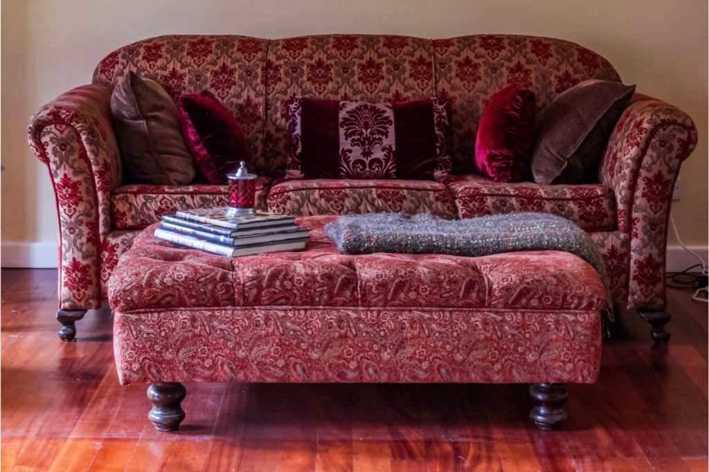
Burgundy is a rich colour inspired by wine which originates from the Burgundy region of France. This sophisticated colour symbolises ambition, wealth and power.
Introducing a colour such as burgundy to your home can add warmth and character.
Interior design is all about mixing and matching, and finding the balance between colours and patterns, and if this is a colour you want to experiment in your home with, keep reading. We explore the colours which go perfectly with burgundy.
Which Colours Go With Burgundy?
This deep, dark red colour is the result of mixing red with a dash of green and blue, creating brown with purple undertones to the colour. This shade is ever so slightly more purple than its close relative, Maroon, which tends to display a fraction more vibrant red. Because of this, burgundy works well with a variety of shades from the colour wheel for some wonderful combinations.
Burgundy & Grey/Charcoal
Burgundy is a hot pairing for a variety of different shades of grey. This is one of the most classic burgundy colour combinations. This is a very popular choice for wedding attire and decor.
They're such a great match because burgundy helps to uplift grey by adding warmth and depth, this is especially true for fashion and interiors. For interiors that are grey throughout, adding burgundy through furniture or decor helps to add contrast and depth to the room.

Burgundy & Turquoise Blue
It's one of those duos that sounds so wrong, but it actually works! Because of the undertones of burgundy, these colours really complement each other. Turquoise is on the cooler side of the colour spectrum so it co-ordinates well with the rich and deep colour that is burgundy. Try adding some turquoise throw cushions to a burgundy sofa, and watch the colours really pop!
Burgundy & Bronze
Bronze and burgundy are a gorgeous pairing. Bronze with reddish hues work perfectly with deep red colours such as burgundy.
Not as commonly seen throughout home interiors, burgundy and bronze are depicted as a classic Christmas combination throughout decorations.
A subtle way of creeping this metal into your home could be through our range of Bronze Sockets & Switches.

Burgundy & Yellow
Specifically golden yellow, works very well with burgundy. The result is a rich and elegant colour combination.
This opulent pairing, can be worked through a home very elegantly. Go for opulence when choosing furniture and accessories, and remember, less is more. They are both very powerful colours that need to be able to work together.
Burgundy & Pink
This combination can be perfectly executed through fashion and interiors. From light to medium shades of pink, you can easily pick up a number to go with burgundy. It's best to avoid neon and striking shades of pink, as it will become a battle of the spotlight! Stick to neutral tones to really allow burgundy to display its vivid nature.
It's a simple and elegant match. This is for those most daring in their home, working pink accessories and furniture into a burgundy room will help to achieve a striking finish.

Burgundy & Green
What makes green such a great compliment to the deep hues of burgundy is the natural richness of both colors.
If we take a look at nature, these colours are commonly seen together such as with the classic rich red of a garden rose paired with the emerald green of its stem and leaves. You could be forgiven for thinking these colours are only spotted together during Christmas, but they're a classic match that can look great in a home.
If you're feeling inspired, take a look at our range of Burgundy lights to bring this gorgeous colour into your interiors.
[related_products is_auto_added="1"]
If this is a colour you want to experiment in your home with, keep reading. We explore the colours which go perfectly with burgundy.
When it comes to natural lighting in our homes, it's something we all struggle to get enough of during the winter months. We know that getting outside for fresh air and vitamin D during the year is important. But what about natural lighting in our home?
There are many studies that support the benefits of natural lighting. With a clear link between natural lighting, our mood and general wellness.
The Benefits of Natural Lighting
Wards Off Seasonal Affective Disorder
SAD or seasonal affective disorder is a type of depression that comes and goes in a seasonal pattern. This is usually heightened during the winter where the days are much shorter and the days much darker. During this time, symptoms experienced can be much more severe.
Whilst the winter months are much harder, there is still pockets of natural lighting that can benefit you both indoors and outdoors. Getting outside and getting as much natural light as possible can help to keep mood changes at bay.
Working from home may have brought a whole host of additional problems to the mix. Especially where it can often be difficult to get out for a walk during the day when it's light. To make the most of the natural lighting on the days you can't get out, position your desk as close to a window as possible or positioning under a skylight if possible.
It Improves Psychological Wellbeing
Never underestimate the benefits of waking up to the sun or heading out for a walk in the fresh air. Natural light has a huge impact on our psychological wellbeing. A lack of daylight can cause mood swings, make us feel down, depressed or anxious which can be part of a wider problem such as SAD. The condition SAD speaks volumes about how important natural daylight is to our mental wellbeing.
Those dark and cold mornings can impact your morning routine. But getting enough natural daylight can help to actively combat negative pscyhological wellbeing. Getting more daylight really does help us feel better as a whole.
It Improves Sleep
It's no surprise that natural lighting has a good effect on your mental health and sleep patterns. A study in 2014 revealed that the office workers who were exposed to more natural light experienced better sleep.
One of the benefits that natural light has on sleep is keeping our circadian rhythm in check. Natural light can help our bodies realign to the natural rhythm they’re supposed to keep. Sleeping in a room with light curtains or blinds that are not blacked out can help you to rise with the light in the mornings. Whilst this might not be so easy to replicate in the winter, certain SAD alarm clocks can help you to continually rise with light in the darker months.
It Improves Productivity & Focus
Poorly lit rooms and dark winter days can make us feel sluggish and distracted. If you're currently working from home, the good news is that natural light can actually make us more productive.
There are strong links between the benefits of natural light exposure and our overall productivity. Particularly in the workplace, natural light has been linked to improved focus, efficiency, and less illness.
Why Does Poor Lighting Cause Headaches?
Not only can poor lighting have an impact on your productivity, it could be the symptom of that daily headache too. This is more likely to happen when you're at home or in a workspace that is using poor lighting choices to make up for the lack of natural lighting.
Fluorescent lighting, overhead incandescent lighting and computer screens can all play their part in triggering a headache or migraine. It doesn't usually matter what the colour temperature of the bulb is when these lighting choices are employed. Causing glare on your computer screen or having to put up with that constant flicker is enough to set any head off.
Choosing the right light choices in your home or workspace is key to keeping those headaches at bay. If changing the light sources is not an option, try repositioning your desk to an area which is not underneath a main light source.
It Can Improve Energy Efficiency
Aside from our mental health, natural light can improve our financial and environmental situation too. Flooding natural lighting into our home means fewer hours of using your lighting and more time to reap the health benefits of natural lighting. To encourage more natural light into your home, opt for curtains or blinds rather then net curtains which can absorb some light. Opt for skylights and floor to ceiling doors or windows where possible to maximum exposure.
Installing solar panels on your home will help take you one step closer to powering your home solely by natural lighting. It keeps your electricity bills low, and you'll be able to reap all of the other added benefits of natural light too.
Natural lighting can bring so many free benefits to our general health and wellbeing. We promise your productivity, sleep and general happiness will thank you for it.
[related_products is_auto_added="1"]When it comes to natural lighting in our homes, it’s something we all struggle to get enough of during the winter months. We know that getting outside for fresh air and vitamin D during the year is important. But what about natural lighting in our home? There are many studies that support the benefits of […]
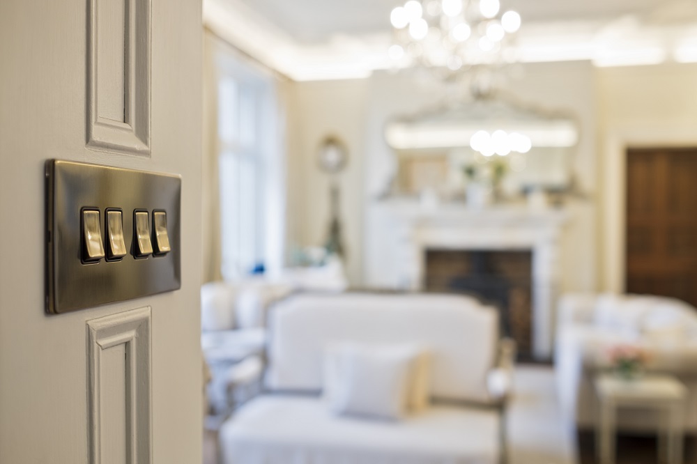
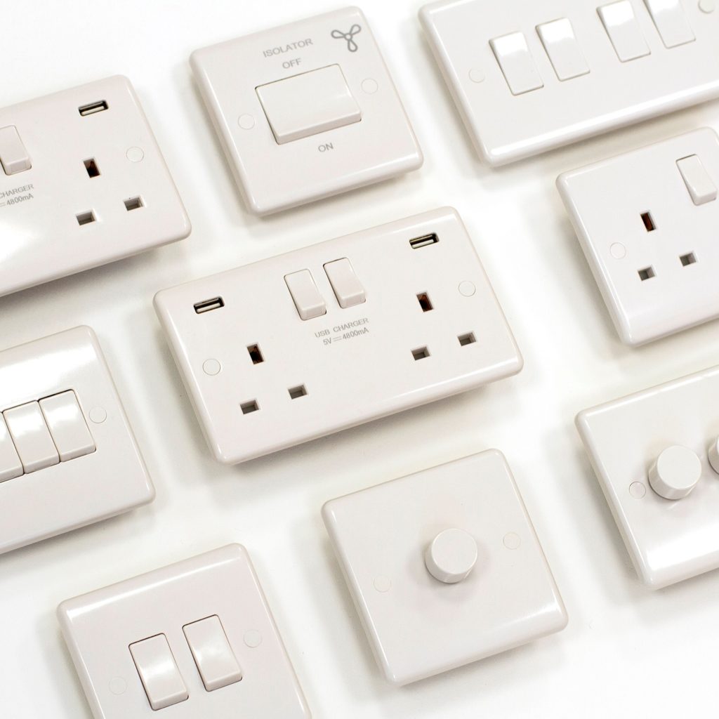
Sockets and switches tend to not take up a big part of any room, due to their size, and often leads people to purchase cheap sockets and switches for their homes. Cost is a big factor when completing a home renovation project, or simply redecorating but there are some things that you can save money on, and some things on which you shouldn’t hold back.
Whether or not sockets and switches are one of the things you should be saving money on really depends on what you need. Obviously, when it comes to sockets and switches, much like anything else, you get what you pay for. So in this article, we will look at the benefits you may find when choosing luxury sockets and switches over cheap sockets and switches.
Luxury socket and switches look better
This is often instantly clear to see. Cheap light switches and plug sockets tend to have a lower quality finish, often have plastic switches rather than metal cladding. Whilst you can find cheap screwless sockets, the better looking screwless plates tend to be more expensive.
Cheap Sockets and Switches don’t feel as good
Luxury sockets and switches tend to feel heavier than cheap alternatives, and more robust. When you hold them in your hand, you can really feel the difference in most cases. The weight may not make much of a difference once fitted to the wall, however the other area to note is the feel of the click of the switch. A cheap socket or switch can really snap when clicked, but a good quality option is more likely to ‘click’.
Check the guarantees
Not all luxury sockets and switches have high guarantees, but they may do. When choosing a range, look at the guarantee length. This not only lets you know that the money you are investing will cover you for a long time, but it also signifies the manufacturer’s confidence in the longevity of their product.

There are many features of sockets and switches that can improve the longevity including rust-proof finishes, quality parts, moisture resistance and a good gasket.
Check the size of the range
This is the area in which cheaper sockets and switches tend to fall down, and it can really ruin a project. Make sure the range of sockets and switches you are looking at has every type of socket or switch that you need. Many cheaper ranges have the basic, common options, but don’t have niche switches or sockets.
Whilst many do have euro plates, allowing you to fit euro modules to complete your range, these don’t look as good as the regular switches and sockets. Keep an eye out for grid switches too, as these can allow you to create a bespoke switch, easily.
Not all faceplate finishes are the same, and if you end up having to choose a socket or switch from another range, just to complete your project, you may end up ruining the look of your décor.
[related_products is_auto_added="1"]Sockets and switches tend to not take up a big part of any room, due to their size, and often leads people to purchase cheap sockets and switches for their homes. Cost is a big factor when completing a home renovation project, or simply redecorating but there are some things that you can save money […]
Imagine finding a range of sockets and switches that perfectly suits your home décor, looks great and is in your price range. Now imagine picking everything you need from that range, and finding all but one of your desired fixtures.
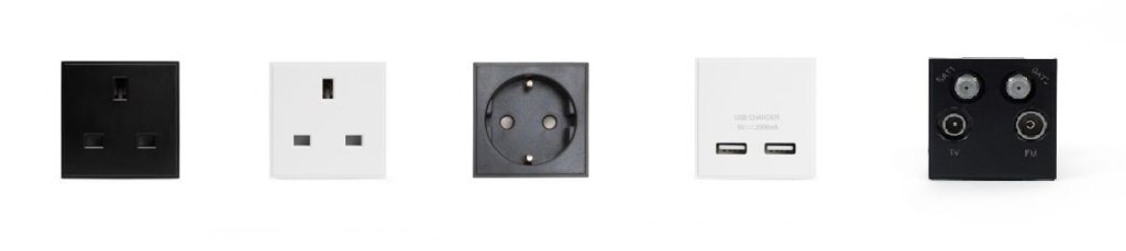
In a world without euro modules or grid switches, the lack of depth in a range of sockets and switches may mean that you need to choose another range, which can be disappointing and frustrating. With euro modules, however you can complete the range with less common items such as USB sockets, mixed with TV sockets, or brush modules, or many other types.
Grid switches allow you to create completely custom switches. You can learn more about these in our guide: Grid Switches Explained. Euro Modules, unlike grid switches are mainly focused around types of sockets.
What do I need to buy for Euro Modules?
The first thing you’ll need is the faceplate. This is the surround for your socket. This should be part of the range. These tend to come in 1 gang or 2 gang, however these can also come in 1 gang, 1 module sizes.
You can then choose from common euro mods, depending on what you need. If the range that you are interested in doesn’t come with euro module faceplates, however then you may need to consider purchasing a different range.
It is also possible to purchase euro module floor sockets, which allow you to add a different type of socket to a floor socket, allowing you to create anything from 5 amp floor sockets to HDMI floor sockets and TV floor sockets.
Black or white inserts?
You will find that euro modules are available in a few different colours, commonly black, white and grey. It is important that you match these to the inserts in the rest of your range. So if the plug insert in your brushed chrome sockets is black, then you’ll need to choose black euro mods to go with brushed chrome euro module faceplates.
How to fit euro modules
The simplicity of these is their best feature. You simply click the euro module into the plate. Just push it in until it clicks. We recommend getting an electrician to fit the socket to the mains though.
Euro modules are interchangeable, as you can pop them out and replace with others of the same size. For example, a 2 module 13amp socket module can be replaced with a 2 module 5 amp socket module. This needs to be done before the module and plate have been fitted to the wall though.
Imagine finding a range of sockets and switches that perfectly suits your home décor, looks great and is in your price range. Now imagine picking everything you need from that range, and finding all but one of your desired fixtures. In a world without euro modules or grid switches, the lack of depth in a […]